
Thomas Farms USA
Ulrieke Rütter
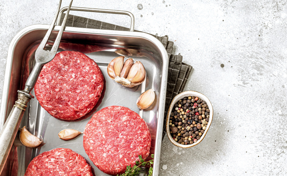
Thomas Farms wanted to launch new high-end Ground Beef products. A new name, tagline, identity, look & feel, tone of voice and personality was needed from us.
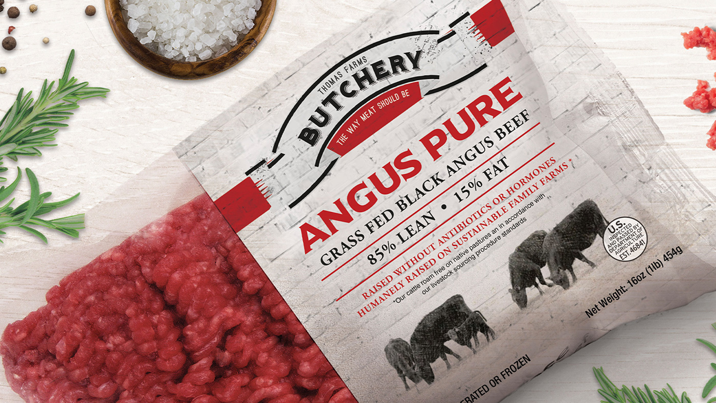
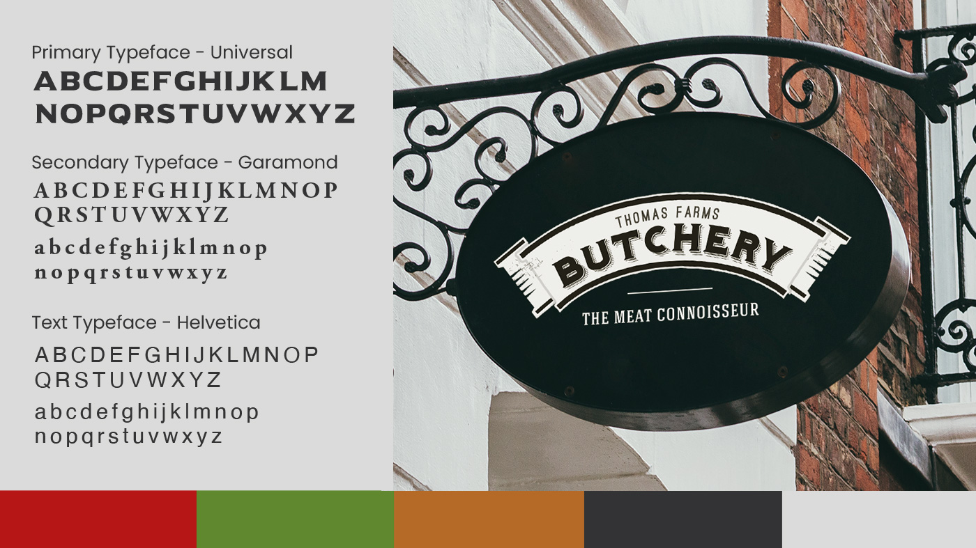
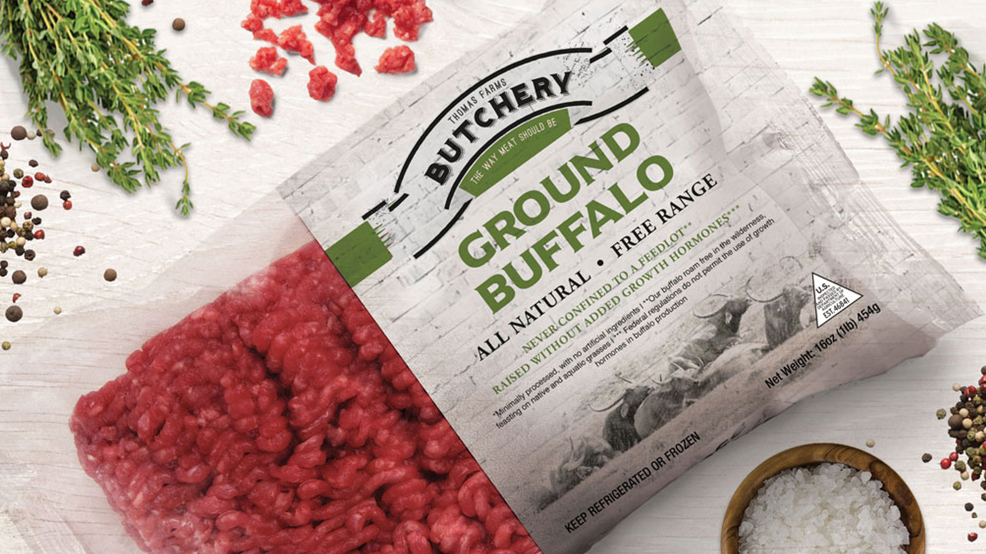
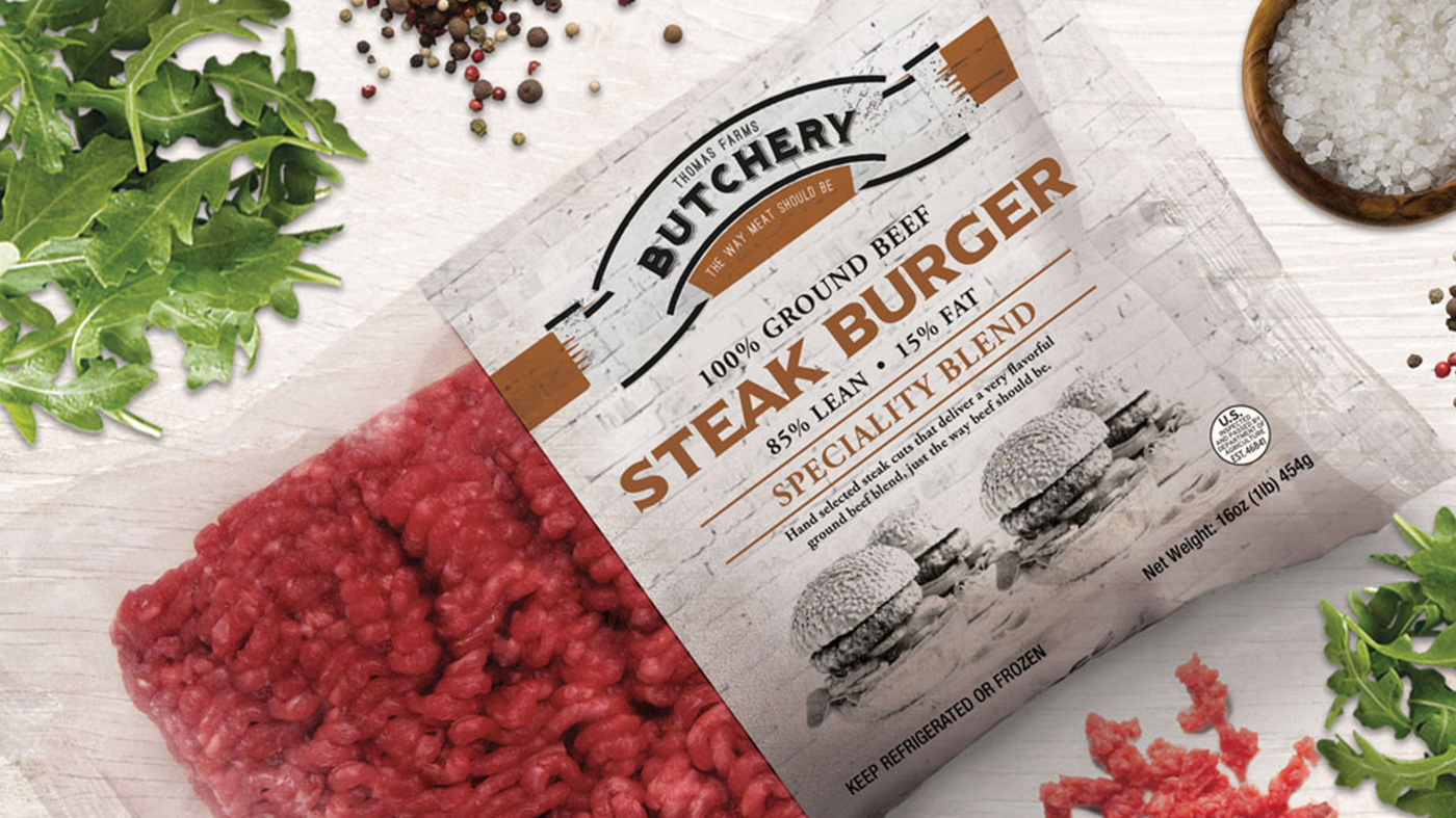
Because the product is high-end we wanted to position the brand as exclusive and not mass produced meat, therefor the concept is all about the 'traditional butchery' that hand selects the meat for you. The name is streaight to the point 'Butchery' with the tagline 'The Meat Connoisseur'. This positions the brand not only as exclusive but also as quality.
After we did a competitor analysis we observed that other brands mostly use black as a brand colour, therefor we did the opposite and went with a white, clean look and feel. This makes the product immediateley stand out from the competitors.
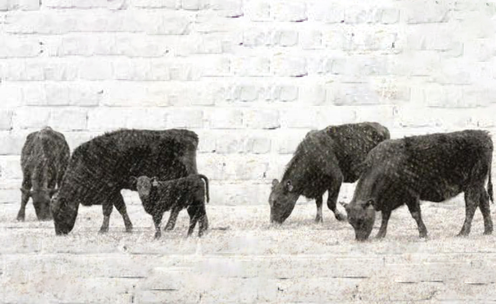
A white brick background is used to amplify the “old butchery” look and feel. All fonts used for the logo and corporate identity also communicates classic, vintage, Hipster. The image style is a hand sketched style that signifies the special of the day written on the wall or board in a traditional butchery. Darker vintage colours are used to differentiate between the different products of the brand. The entire brand gives the gourmet, organic feel.
This project is featured on DesignRush as one of the best Meat Packaging Designs. Want to know more about DesignRush? Read Below.
Best Design Awards | DesignRush
Discover the best designs across website, logo, app, print, video, branding and marketing campaign categories worthy of best design awards. Get inspired!
www.designrush.com